I took up this course as it connected well with my motivation to use technology as a means of providing answers to the daily / occasional requirements of information seekers.
Among the concepts that I found fascinating while applying them to understanding and evaluating websites was the 10 usability heuristics for User Interface design as propounded by Jacob Nielsen.
I had opportunities to evaluate websites of different organizations and compare them against each other on the basis of their adherence to or deviation from these 10 general principles for interaction design.
It was gratifying to finally be able to finally put a finger on why some websites were not so convenient to use while others seemed to be designed with the user in mind.
The in-class group activities gave me a practical glimpse of what to expect with each stage of the user experience design process.
Through the main project (done with my teammate), I was able to bring a cohesive structure to the implementation of a website from start to finish (all the while keeping the user in focus).
The wireframing activities enabled me to put myself in the shoes of a potential customer who knew the requirement but was unable to present or verbalize the needs.
Having a third person to offer feedback / criticism on a webpage or information resource was a new and enlightening experience for me.
Being vulnerable was both exciting as well as a scary experience due to the unpredictable nature of the situation.
This project was to be a resource for people planning to settle in Vancouver and are currently unfamiliar with the city. The objective was to help the user group make informed decision on where to live in the city.
Wireframes were rolled out and user views were taken into account before arriving at the final prototype.
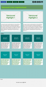
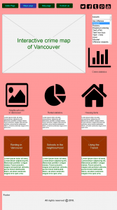
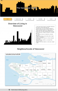
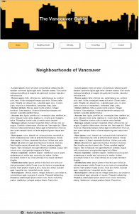
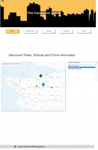
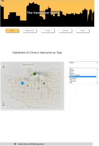
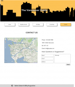
The prototype of the completed project was designed as a website using wix.com and can be found here.

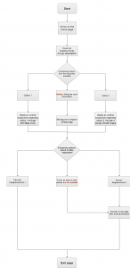
Through this exercise some aspects that were learnt included the vulnerability experienced when allowing the clients to examine the suitability of the design at the wireframing stage. Visualization of concepts, problems and solutions was among the other learning moments here. The immense satisfaction of being able to use technology to solve an actual need of a user defies verbal explanations.