Introduction
For this term project, inaugural and farewell addresses by 8 American presidents were selected from an original dataset of 58 speeches available in the American Presidency Project. These presidential addresses were considered owing to their national significance in semantic and contextual terms and hence formed the core dataset for qualitative textual analysis. The chosen presidential speeches were those by Truman, Eisenhower, Carter, Reagan, H.W Bush, Clinton, G.W Bush, and Barack Obama.
Visual Analysis (VA) tools such as Voyant and Tableau were identified for the textual/visual analysis to identify visible patterns through exploratory data analysis and come to meaningful and definitive conclusions. Voyant is a VA tool that has been designed for textual visual analysis. Tableau while well suited for structured tabular data, can be used for textual analysis with suitable data preparation. The method of analysis of this dataset was qualitative textual exploratory data analysis. The analysis using the VA tools proceeded with the hope of seeing patterns in the data to frame the hypothesis at a later stage.
Overview
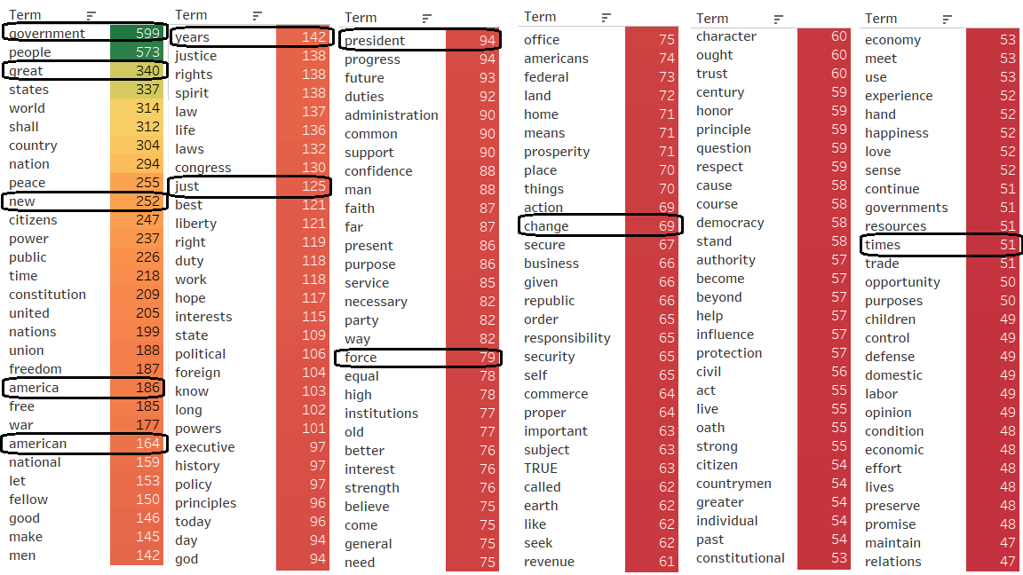
In keeping with the motto of visual information seeking by Ben Schneiderman’s which is “Overview first, zoom and filter, then details-on-demand”, an overview of the corpus was obtained with prior data preparation for use in Tableau. The preferred (frequent) word usage by the 58 American presidents was visually sorted using a Tableau generated Treemap viz as seen below.

The highlight tables viz (Tableau) provided insight into the word count without having to hover over the word as in the earlier Treemap viz.
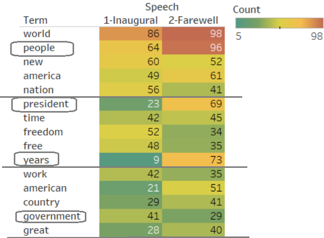
After narrowing down the dataset to addresses by 8 presidents, the highlight table viz was also used to compare word count between inaugural and farewell speeches as shown below.
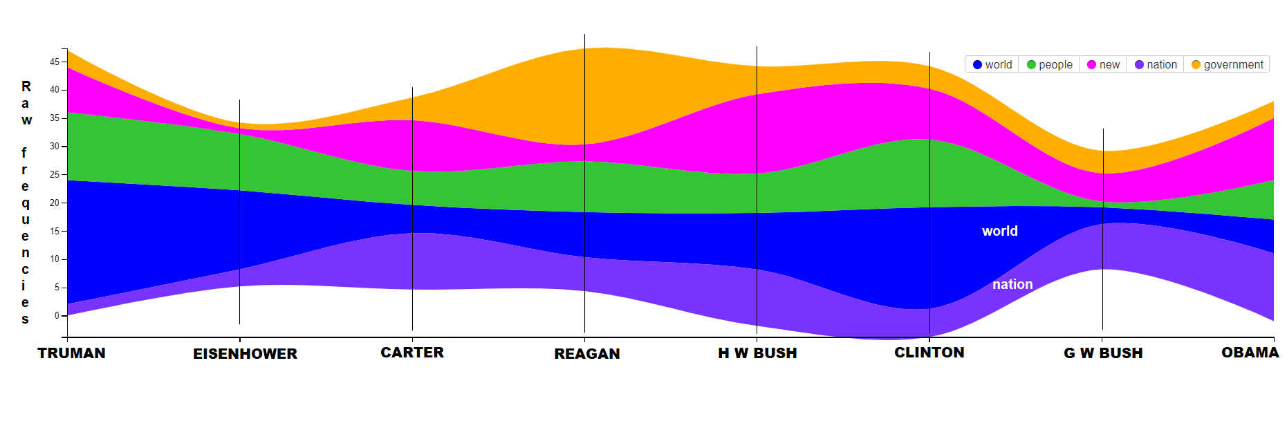
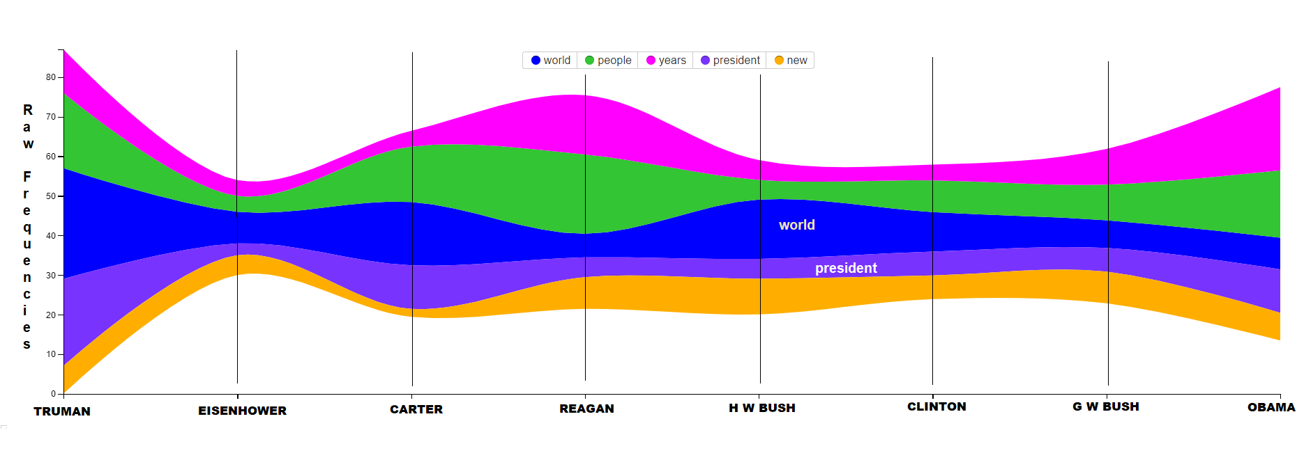
StreamGraph overview of 8 presidential inaugural speeches
Voyant was used to generate streamgraph showing common word choices over time in the selected 8 presidential inaugural speeches. The viz shown below highlights the use of terms such as 'government', 'new' etc in conformity with the overview. Streamgraph utilizes visual design channels of colour, size and line (with a sense of flow over time) aiding pre-attentive visual processing of data reducing cognitive load.
The streamgraph for the farewell speeches of the selected 8 presidents highlights the change in preferred word usage as shown below. Emphasis on words such as years, president along with declining usage of words such as new is visible through this analysis.
Bubblelines of Obama’s inaugural addresses in 2009 and 2013
Bubblelines are another fantastic tool that add in a lot of useful information in just viz. It has a timeline showing the length of the document (or speech in this case). Another additional feature that can be utilized with the bubblelines viz is that the usage of each word can be spread over a separate line, as shown below. This brings in more clarity and again reduces the visual cognitive load on the viewer.
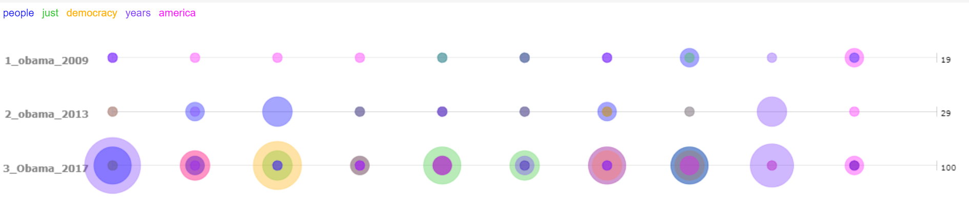
This viz gives the viewer a quick indication that the visual representation of the farewell speech given in 2017 is quite different from the remaining two speeches. On digging further using the same VA tool, we see more details emerge as seen in the following option of the visualization. Here we see the words separated on individual lines and are better able to appreciate the differences in word choices and emphasis in different addresses.
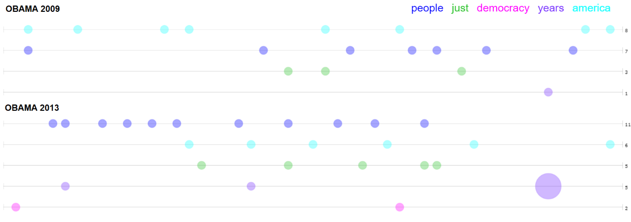
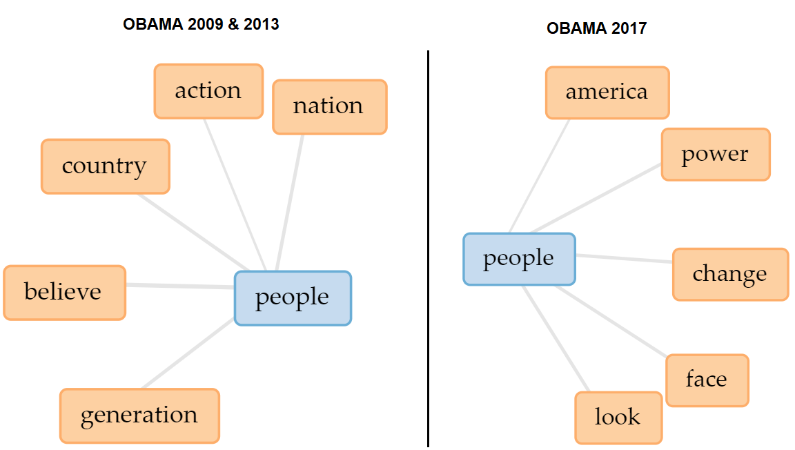
Obama’s first inaugural speech delivered in 2009 as shown above shows a uniform usage of the word america and the absence of the word democracy. It can also be seen that the inaugural speech of 2013 however shows a marked increase in the words people and years introducing the time component in the speech.
Bubblelines of Obama’s farewell address in 2017
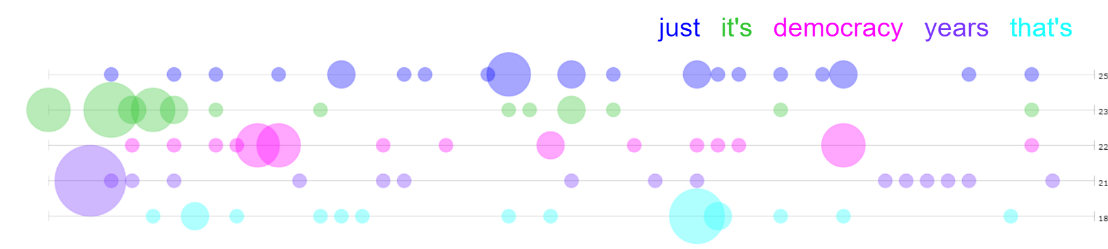
Obama’s farewell address shows a drastic deviation from both previous speeches with emphatic use of the word democracy, years and a personal favorite just. The word just however on further analysis was only found to be used only once in the context of being fair.
Trends visualization
Trends viz has a few options and the stacked bar graph + line was chosen during the analysis of this dataset. There is a level of detail in this viz that was useful to understand how the top word choices varied over each of the periods of the presidency as reflected in the addresses. There is a usage of viz design channels of line and colour.
A trends viz showing the variation of top 5 word choices in speeches of Obama is shown below.

Some may prefer the Trends viz over the Bubblelines as again there are more options available. The drastic increase of the usage of the word ‘democracy’ towards the farewell speech is very clear in this viz. The surprising decline in the usage of the word ‘people’ is also magnified in this viz.
Putting words in context
In an effort to determine whether there was a significant change in the context of word usage for the same word as applied in different speeches, the word ‘people’ was seen through the links viz in Voyant. First the word was seen in the following contexts as used in the inaugural speeches given in 2009 and 2013. The context and links were observed when used in the farewell speech in 2017.
Interesting findings using Scatterplot viz
There were some surprising discoveries related to the selected VA tool(s) and some related to the dataset itself. Regarding the main VA tool (Voyant) it was found that the scatterplot visualization had a very useful feature enabling the discovery of similar documents through a document similarity measure. This was very useful to find the similar (and conversely the dissimilar) documents within the chosen corpus. The three-dimensional scatterplot representation of the percentage of total association was used in the analysis of this dataset. The subset of 21 documents that were in this corpus (inaugural and farewell U.S. presidential speeches) were subjected to this analysis. Here as shown in the Scatterplot visualization below, dimension 1 (position in X-axis) contributes to 17.01%, dimension 2 (position in Y-axis) contributes to 15.71% and dimension 3 which is shown by the fill takes up 11.86%.
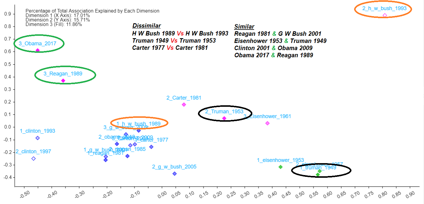
There were some interesting findings in this process. It was found in the scatterplot document similarity visualization that similarities existed between the following presidential addresses;
1. Obama-2017 and Reagan-1989
2. Reagan-1981 and GW Bush 2001
3. Truman-1949 and Eisenhower-1953
4. Clinton 2001 and Obama 2009
The surprisingly dissimilar ones within speeches made by the same president were the following;
1. HW Bush 1989 Vs HW Bush 1993
2. Truman 1949 Vs Truman 1953
3. Carter 1977 Vs Carter 1981
This became a sort of a launching pad to identify patterns and arrive at some meaningful hypothesis. The patterns noticed through this visualization and subsequent analysis of other visualizations brought out the fact that inaugural speeches were clearly different than farewell speeches in more ways than one.
This was further emphasized by the following types of changes as seen through the following;
1. Word frequency counts (drastic changes between inaugural and farewell speeches)
2. New word introduced (this was seen mainly in farewell speeches and not much between first term and second term presidential addresses.
3. Word context changes during the first inaugural speech, second inaugural speech (if applicable) and the farewell speech.
Conclusions
Some of the salient findings from this visual textual analysis are as follows:
• With Voyant, the distinction between inaugural and farewell addresses can be identified using visualizations such as scatterplots, StreamGraphs, Trends, Bubblelines etc.
• Word frequency counts need to be combined with word context studies to gain a fuller understanding of the corpus.
• Careful application of info viz design principles can serve to enhance pre-attentive visual processing decreasing cognitive load on the viewer providing more avenues for better and more meaningful conclusions.
Pros and cons of VA tools and their contribution to the analysis
Being a qualitative text-based exploratory data analysis, it began without a hypothesis in mind. However, as the analysis progressed, some patterns began to emerge as the dataset was introduced for interactions with the VA tools. It was observed that both the useful features and limitations of the VA tools influenced the direction taken by the analysis. Keeping this in mind, the following were some of the advantages of the VA tools used in this analysis;
1. Tableau has the advantage of being able to deal with huge datasets without any major issues. This was again evident while using Tableau as a VA tool for generating the overview (big-picture) visualizations.
2. Tableau as a VA tool was a lot friendly to the user and one could experiment with the various visualizations it offers (24 of them) along with available customization options that it provides.
3. As discussed in this paper, Voyant has a great variety of features that are designed to aid visual textual analysis. There are overview visualizations such as those provided by Cirrus, StreamGraph, Trends, Scatter plots etc. There are also those that give the viewer a closer look at the data such as Terms, Context, TermBerry, Wordtree, Links etc. Having these options is useful to choose the best possible representation for each specific task.
Some limitations of the VA tools as observed during the analysis were as follows;
• One common limitation that applied to most of the VA tools was that time and effort was required for data preparation based on the existing format of the dataset and its compatibility with the chosen VA tool.
• Another disadvantage was that these tools only performed visual representation of the data and left the interpretation and analysis to the user which lends itself to possible biases especially if the researcher comes in with a predetermined hypothesis in mind.
• Also, some visualizations were vague on details and required additional details derived from some others to arrive at definitive conclusions.
• Sentiment analysis which was considered in the project planning stage was abandoned in the final analysis of this dataset owing to lack of clarity on its NLP algorithm used and difficulty in extending the results generated to arrive at meaningful conclusions.
Final Poster
Through this activity, I learned the value of using visualization tools such as Voyant and Tableau in textual analysis. I had the satisfaction of observing patterns that established similarities and differences between the inaugural and farewell speeches of American Presidents. This course and project activity reinforced my curiosity and interest in information visualization and underlying principles